Hi, I'm Luke Beretta. Product designer and builder based in Cape Town.
I make complex products clearer and easier to use.
My work spans payments, crypto, investment platforms, and tools for productivity.
Hi, I'm Luke Beretta. Product designer and builder based in Cape Town.
I make complex products clearer and easier to use.
My work spans payments, crypto, investment platforms, and tools for productivity.
Journey combined presentations, documents, and interactive content in one link for sales, fundraising, and customer onboarding. For Journey 2.0, I owned the editor and reading experience, working with the founding designer.
We shared AI editing, reader questions, and analytics. The goal was to introduce AI and more flexible content without compromising editing control or mobile readability.
Role: Senior Product Designer
Timeline: Sep 2022 – Dec 2023
Teams: Founders, Product, Engineering, AI/ML
Slides and embeds limited layout control and mobile readability. Introducing AI also required a format people could edit after generation.
We moved to native blocks and responsive layouts, bringing generated and manually created content into the same editing model.
Content structure. How the editor’s content model shaped the published document.
Mobile reading. The relationship between content layout and the recipient’s screen.
I kept the editor close to the published view, placing tools around or over content without changing its layout. Creators could move, resize, and align blocks within limits that protected mobile readability.
Structured layouts adapted and stacked on smaller screens. Sensible defaults reduced setup, while text-selection tools and block menus kept manual and AI actions close to the content.
Block canvas editor. Combining and arranging different content types.
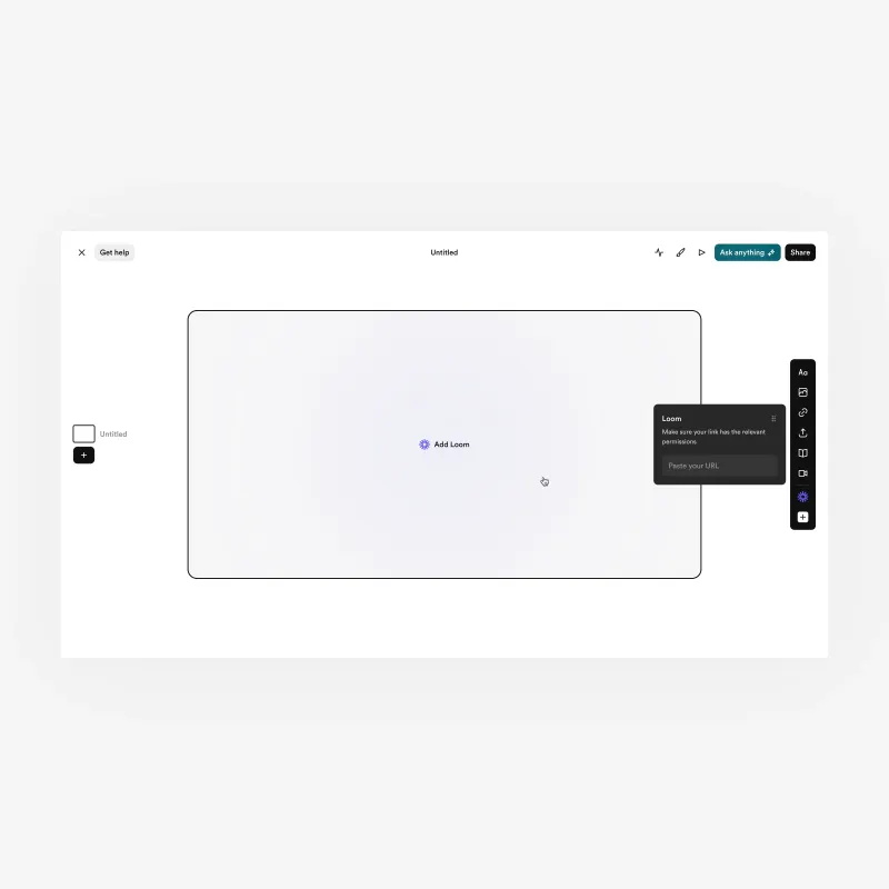
Embedded content. A video block within the editor.
Journey 2.0. The block-based editor and published experience.
Layout controls. Moving, resizing, and aligning content in the editor.
Editing controls. Contextual actions for text and individual blocks.
Three starting points: template, AI draft, or blank canvas. A company domain supplied branding through automated theming.
My AI work focused on editing and regeneration. With the founding designer, I integrated AI actions into ordinary editable blocks so creators could refine generated content using familiar controls.
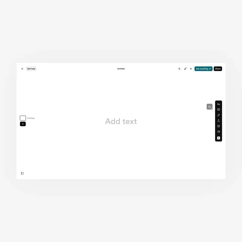
Blank canvas. One of three entry points, alongside templates and AI‑generated drafts.
Automated theming. Brand coherence derived from a company domain, no design knowledge required.
Draft generation. AI produces a starting document that remains editable.
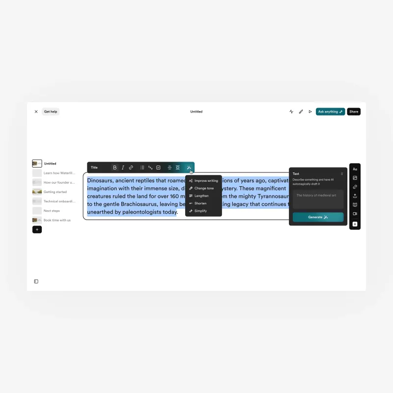
AI editing. Contextual tools alongside the normal text and block controls.
Desktop readers could scan a section list and jump to content. On mobile, I moved the list into a drawer to preserve reading space.
For Ask Anything, I shared design with the founding designer. I worked on answers, sources, suggested questions, and creator controls for configuration and disabling the feature.
Recipient experience. Designed for clarity, pacing, and engagement across devices.
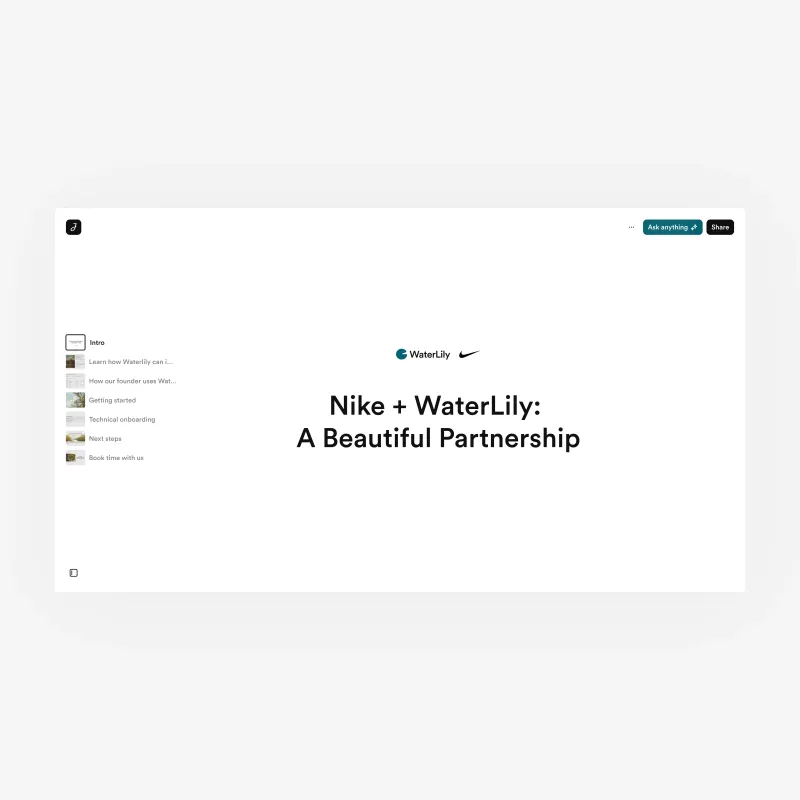
Reader experience, desktop. The published Journey as received by a recipient.
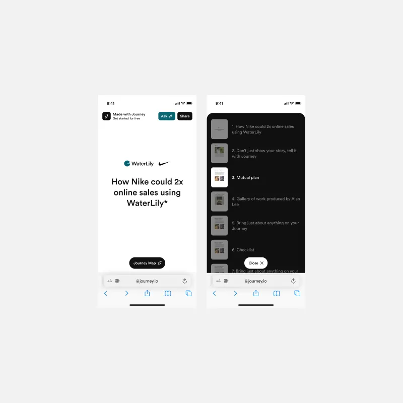
Reader experience, mobile. The same Journey adapted for mobile without manual adjustment.
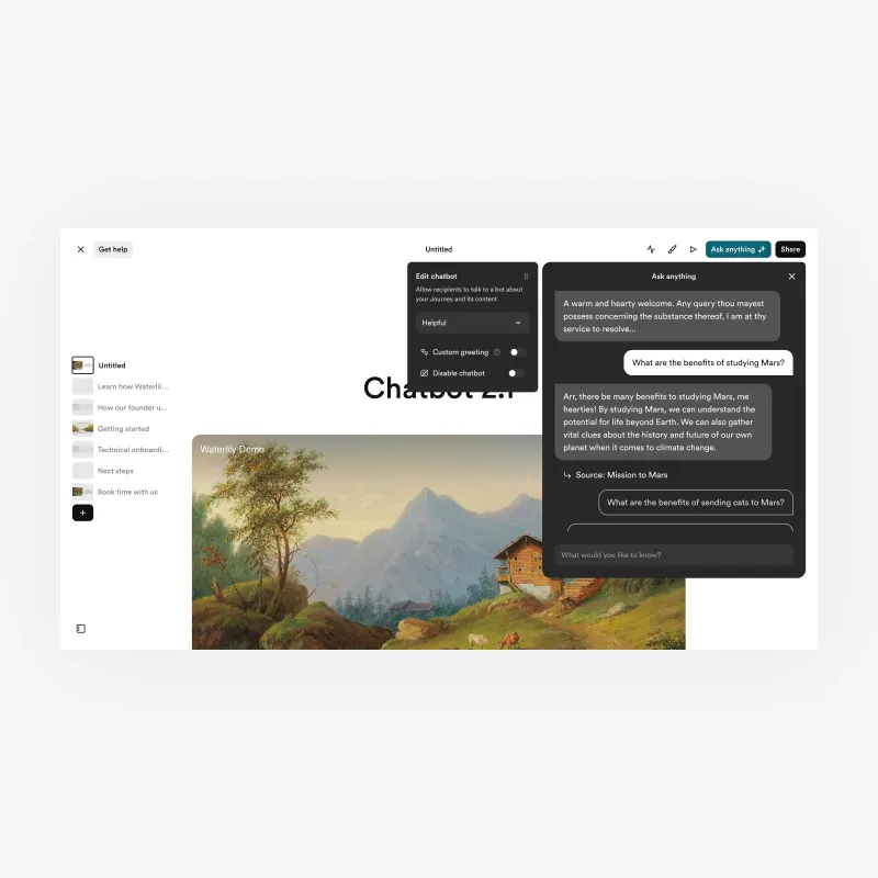
Ask Anything. Reader questions, source references, and creator controls.
I shared analytics design with the founding designer, organising overview, table, and detail views around engagement by visitor and section.
Product data, customer-facing colleagues, and internal reviews informed the work. I checked editor and reader prototypes across screen sizes.
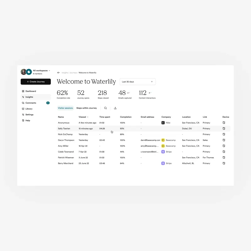
Engagement overview. Visitor sessions, section engagement, and completion in one view.
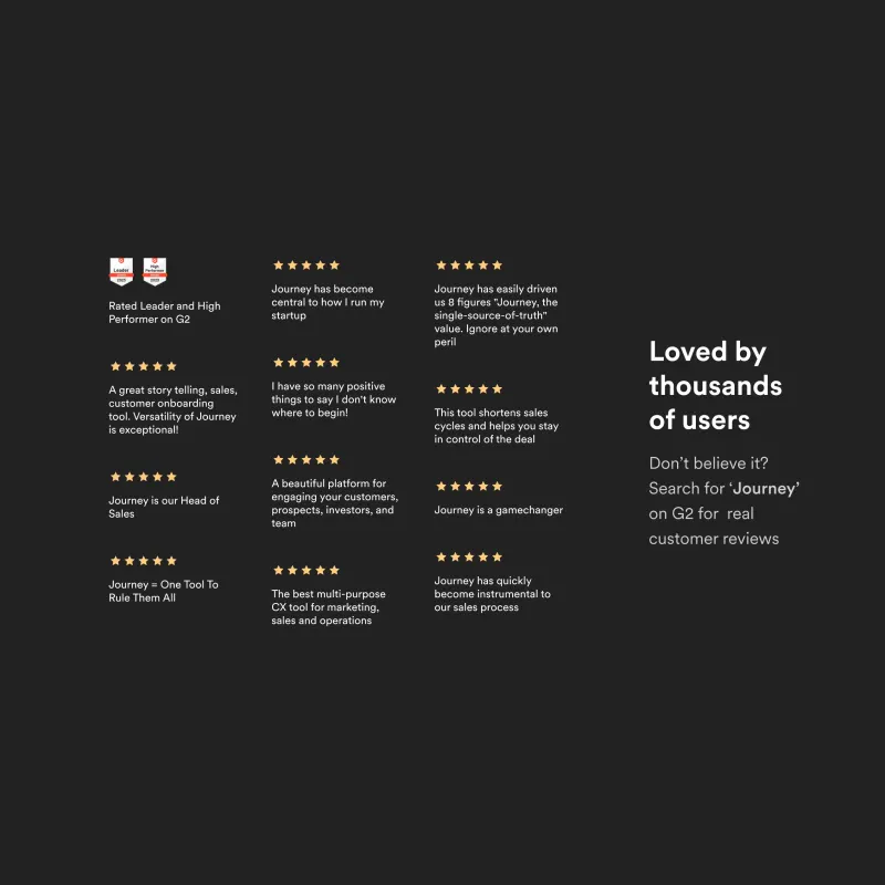
User feedback. Journey reviews on G2.
The team reported higher publishing volume after Journey 2.0, reflecting both growth in creators and more publishing by existing creators.
Most of the redesign shipped; some iterations remained unfinished at departure. Journey was acquired after my work ended.
Spritz lets people use crypto to pay bills, transfer money to bank accounts, and fund a Visa card. As the sole product designer, I led an app-wide redesign, translating an agency-created brand identity into a premium product experience.
I set the visual and interaction direction across payments, onboarding, and cards, and guided marketing aesthetics. Product and engineering partnered with me on priorities and implementation.
Role: Principal Product Designer
Timeline: Nov 2024 – Nov 2025
Teams: Product, Engineering, Marketing
The agency supplied the identity. I defined its application across the app, pushing a darker, more restrained interface with clearer hierarchy and consistent interactions. The aim was to build confidence among customers moving larger sums, including high-net-worth crypto holders.
I built Aperol to carry that direction into shared foundations, component states, and responsive patterns. Engineering reused the components; I documented behaviour, ran walkthroughs, and reviewed builds.
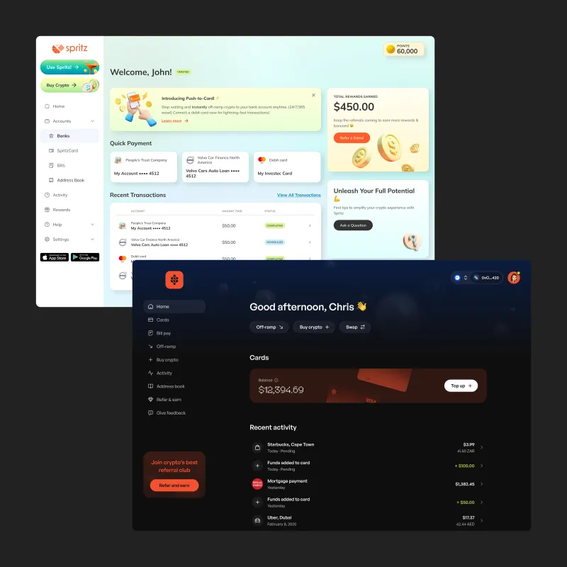
Dashboard before and after. From playful styling to a darker, more restrained product interface.
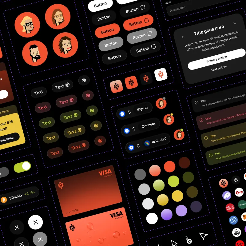
Aperol design system. Foundations, variables, and reusable product components.
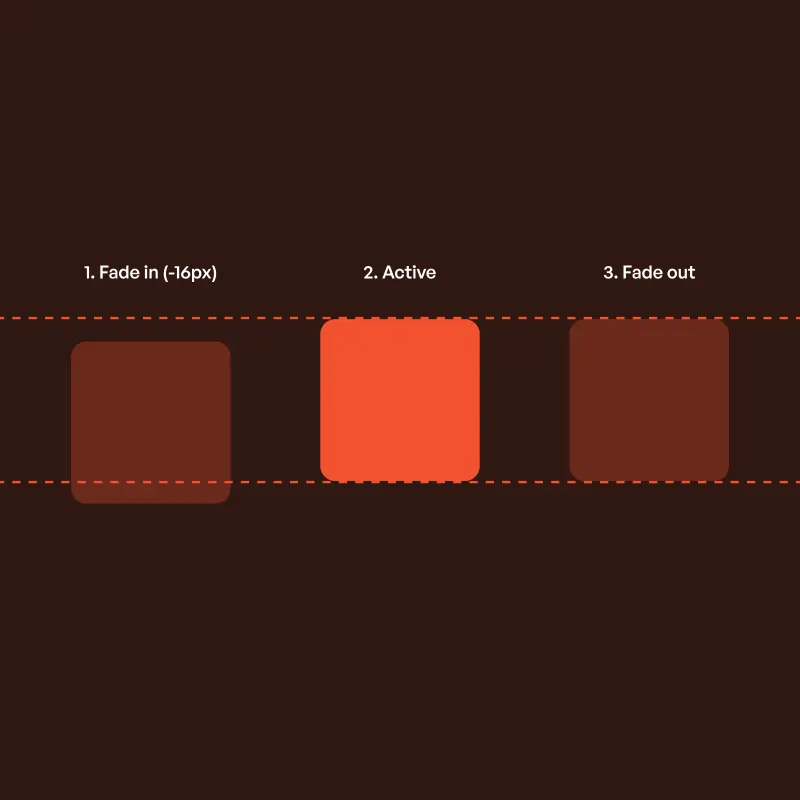
Motion specification. Using spring physics to define consistent interaction behaviour across the product.
Payment types had separate flows. Customer sessions exposed confusion around fees and recipient amounts. I proposed one shared approach and secured priority over other features, shifting engineering capacity toward core payments and mobile usability.
I consolidated multiple setup screens into one payment form, clarified wallet, asset, and network selection, and made fees and recipient amounts clear before confirmation. The previous screen count varied by payment type.
I designed for mobile first. Verification requirements, external wallet interactions, and the existing implementation constrained how far we could simplify.
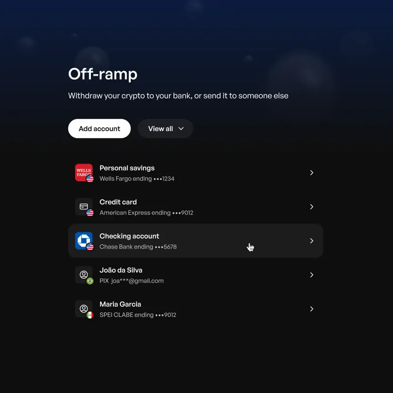
Off-ramp. Managing destinations for transfers to bank accounts or other recipients.
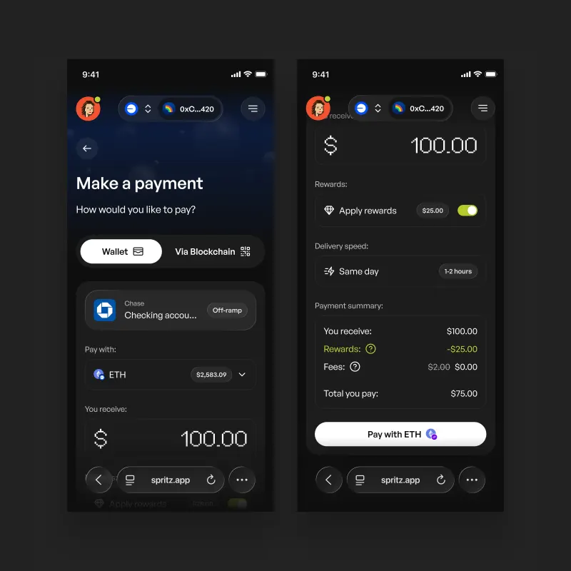
Payment form. Asset choice, receive amount, rewards, delivery timing, and a payment summary.
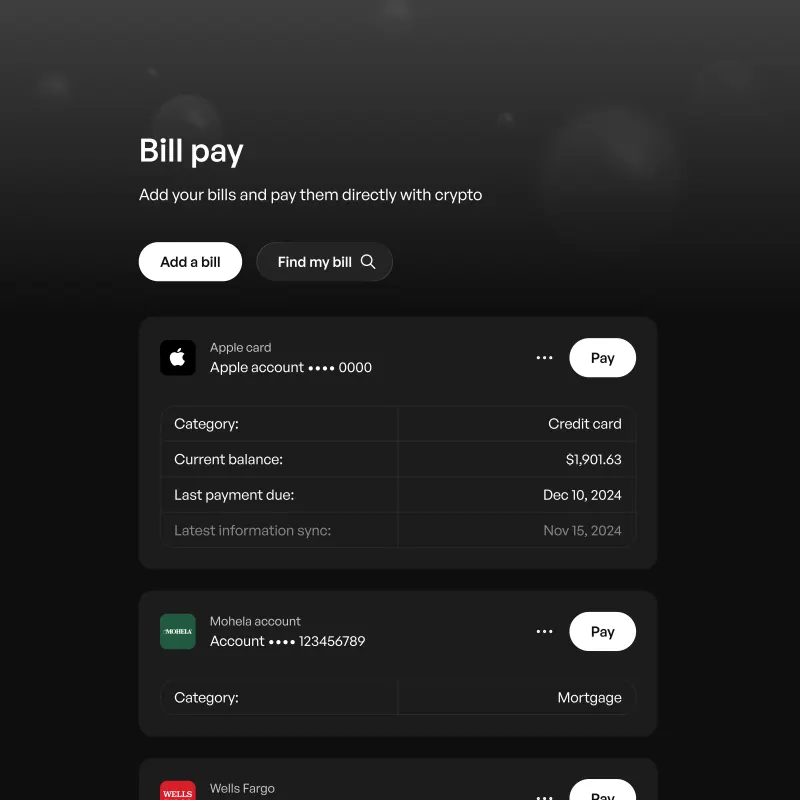
Bill pay. Balances, due dates, and the payment entry point.
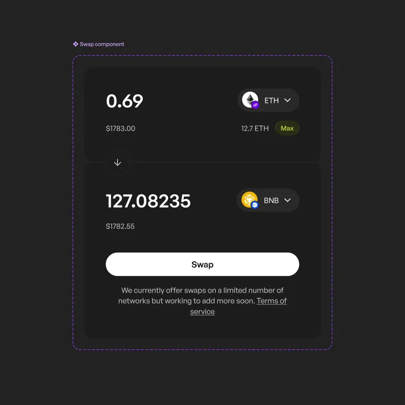
Swaps. Supporting cross‑chain transactions with simplified confirmation.
Users could explore before verifying. Requirements appeared when an action needed them and varied by product, market, and account state.
I defined a shared pattern for requirements, pending checks, errors, and returning to the original task. Each state explained whether to wait, correct information, or contact support. Implementation varied across the product.
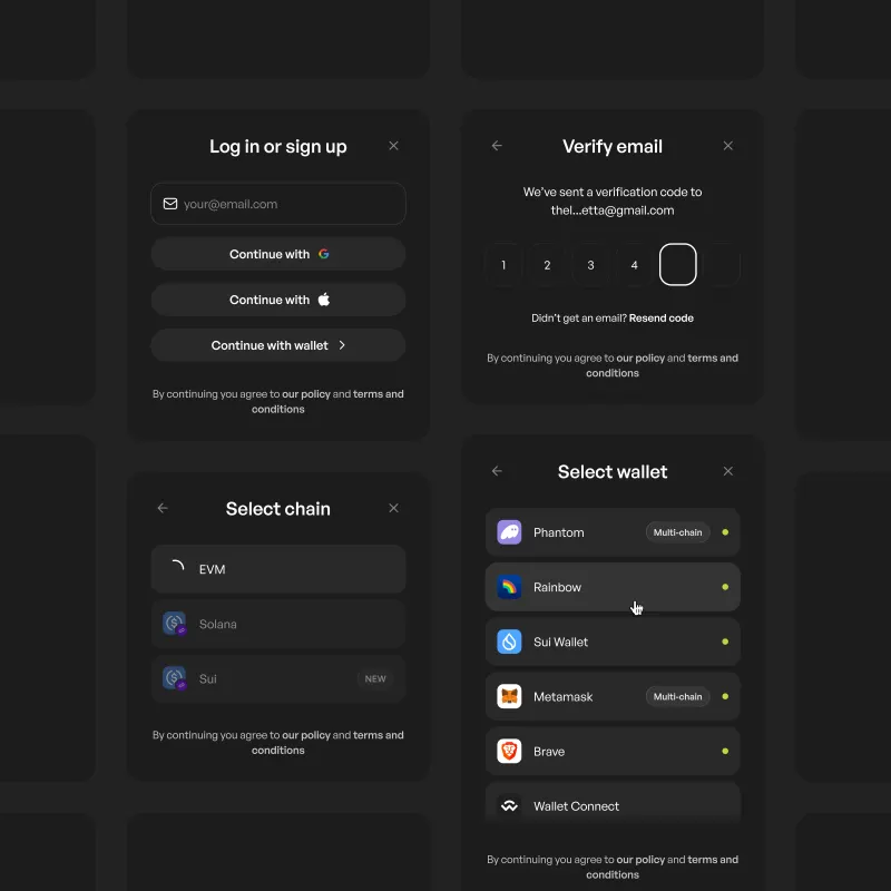
Unified authentication flow. Supporting both traditional and wallet‑based entry points.
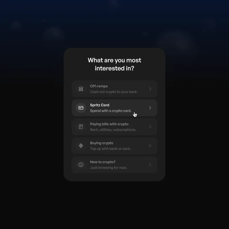
Intent capture. Routing users based on goals and feeding segmentation data into lifecycle systems.
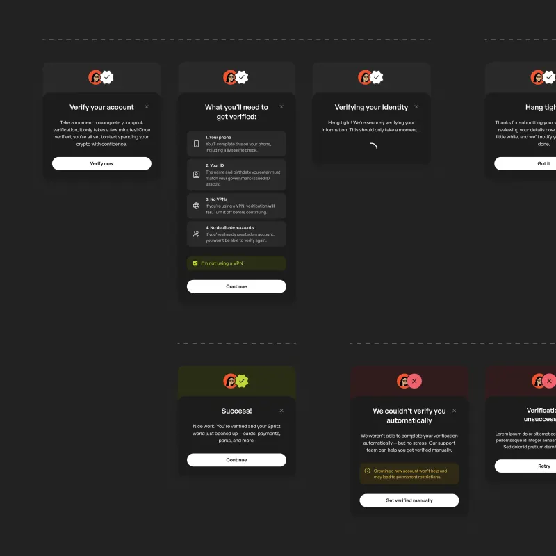
KYC pre‑screen. Setting expectations before entering verification.
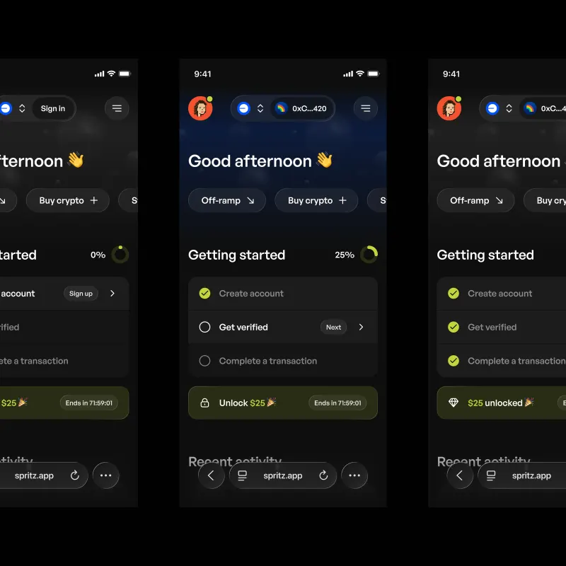
Getting started checklist. With progress tracking, error states, and reward incentives.
I owned card selection, application, delivery, activation, and management. Eligibility and verification made this a longer journey than signup, particularly for physical cards.
The card area adapted to the user’s status. A progress tracker showed remaining steps and the next available action.
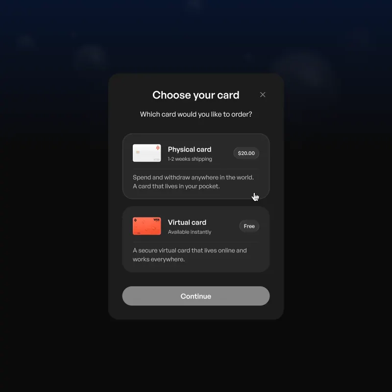
Card selection. Virtual and physical options presented with clear trade‑offs.
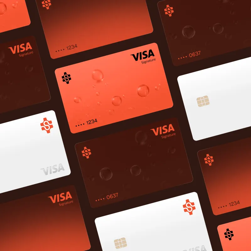
Custom card design. The Spritz Visa across physical and virtual formats.
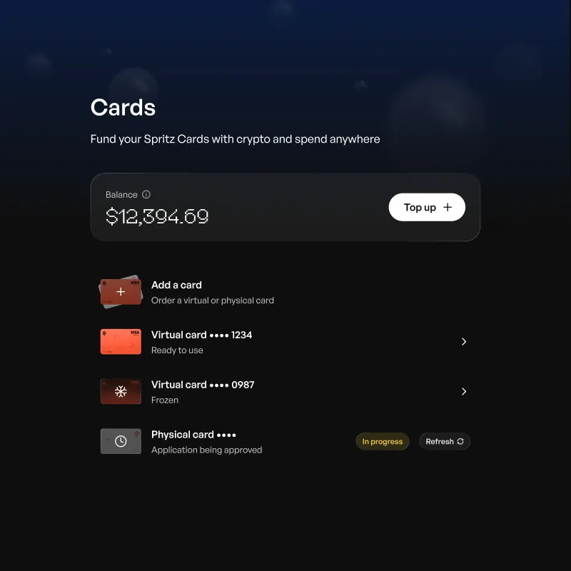
Card states. The card area changes with application, delivery, and activation status.
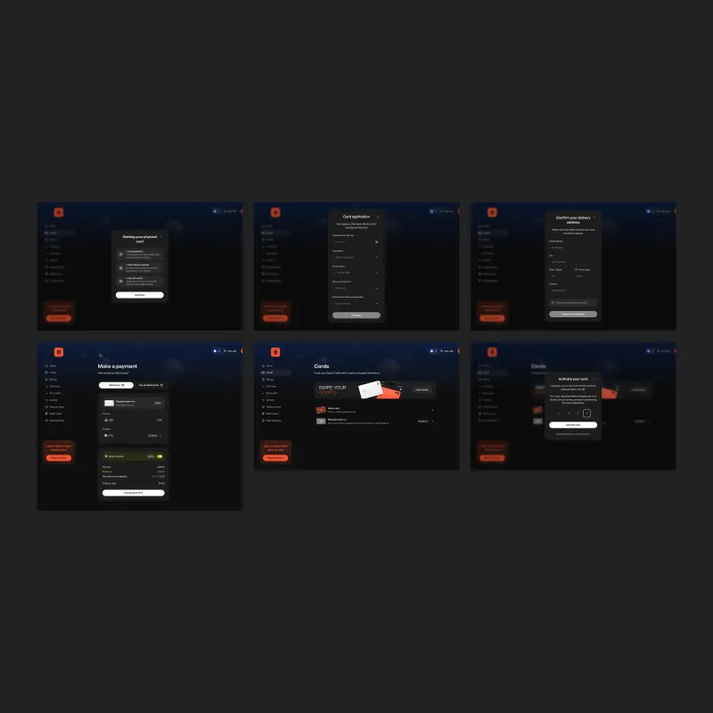
Activation flow. With delivery context and simple verification.
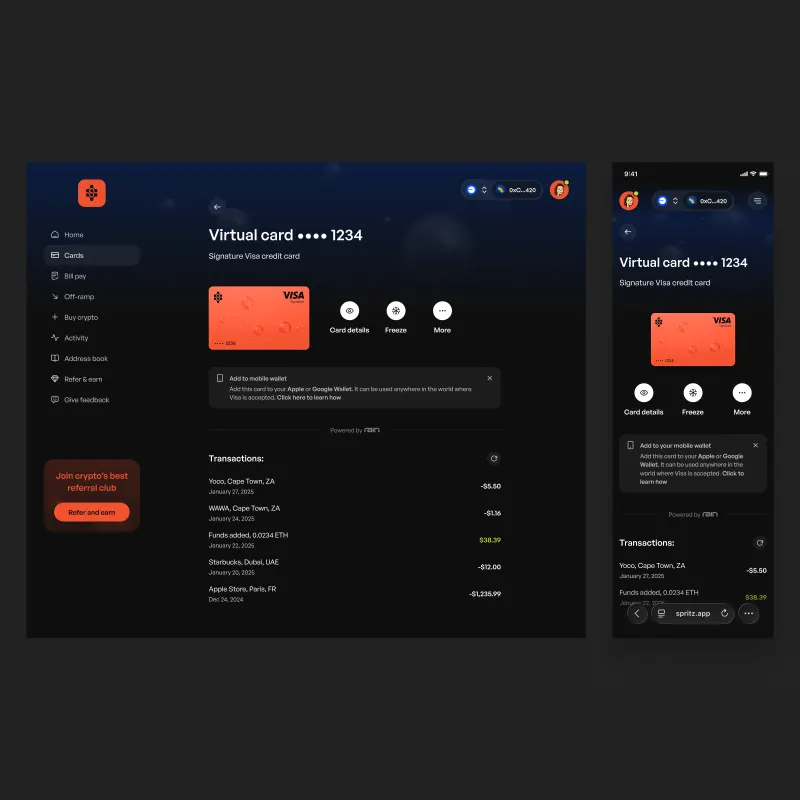
Card detail. Combining controls, wallet integration, and transaction history.
Signup campaigns offered rewards without clearly guiding users through setup and claiming. I designed checklists and empty states around a shared onboarding structure, with steps and content adapted to each campaign.
Marketing reused the implementation across campaigns. Support reported fewer reward-claim questions. I also added in-app feedback and clarified referral progress.
When a card provider froze funds, leadership defined a recovery offer. I designed the balance, terms, and claim flow, visually distinct from normal payments. It reached affected users substantially as designed.
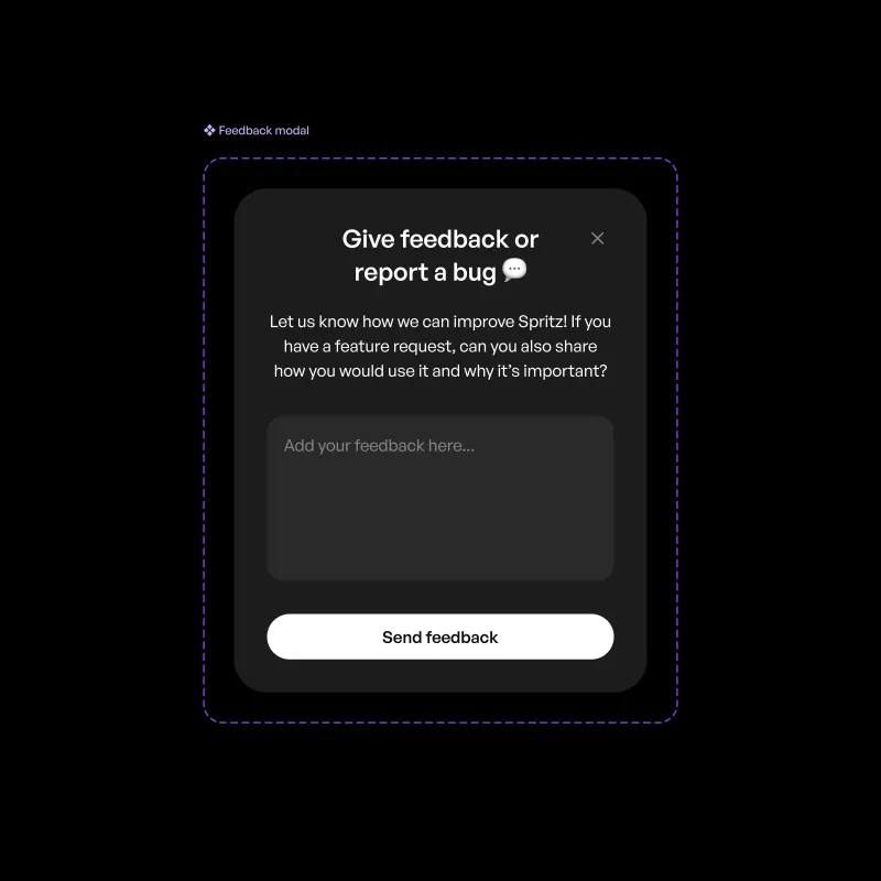
In‑app feedback. Designed to capture high‑quality user input.
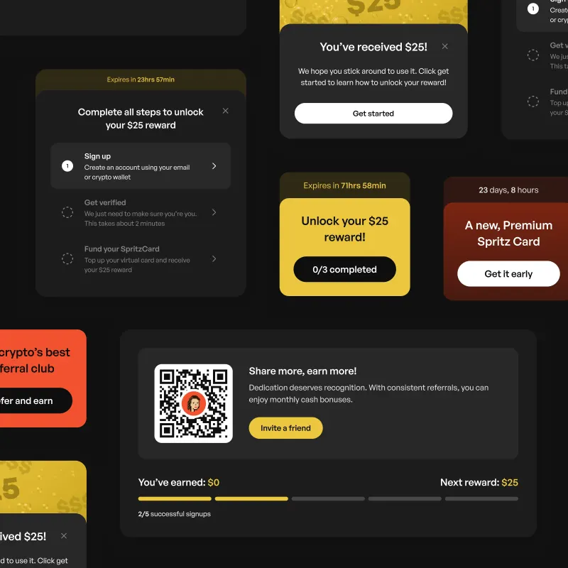
Referrals and rewards. With clearer progress and incentive structures.
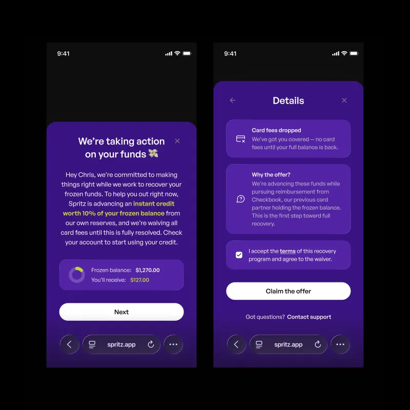
Recovery offer. A dedicated flow for explaining the offer, reviewing terms, and claiming credit.
Users praised the more premium look and feel. The direction informed subsequent product and marketing work.
One payment setup form replaced multiple screens. Marketing reused campaign onboarding, support reported fewer reward-claim questions, and engineers reused the components in later work.
Payments and cards rolled out in stages; some work remained unfinished when I left. Looking back, I would strengthen the transition from claiming a reward to ongoing product use.
Kurtosys helps investment managers distribute financial information through websites, portals, and reports. I grew from product designer to lead across the platform, client products, and brand.
I established a shared design language, brought design into decisions earlier, and reviewed work across product, client projects, and marketing.
Roles: Product Designer – Lead Product Designer
Timeline: Nov 2018 – Feb 2021
Teams: Product, Engineering, Marketing, Client Services
I started with a BNY Mellon reporting tool, owning design and working alongside frontend engineers. I also began improving the core platform.
Fragmented navigation and repeated bespoke work made consistency difficult. I defined shared navigation, typography, layouts, and components for the platform and client products.
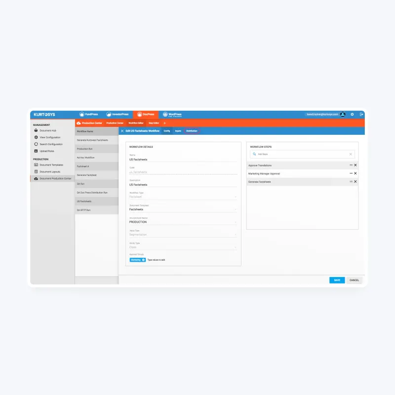
Before. Multiple navigation patterns and overlapping product identities.
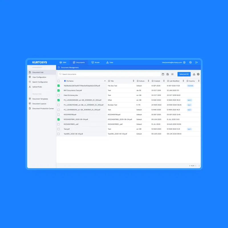
After. A shared application shell and navigation model.
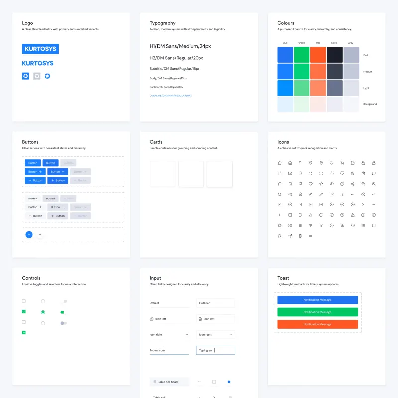
Foundations. Typography, colour, and core visual language.
I built and maintained the design system alongside product and client delivery, covering interface components, charts, tables, and reporting layouts.
Designers reused templates; engineers reused production components and styling. I ran walkthroughs, wrote guidance, and worked with product and leadership to make reuse the starting point. Studio Apps provided configurable financial content modules.
Design system. Foundational components and patterns used across product and marketing.
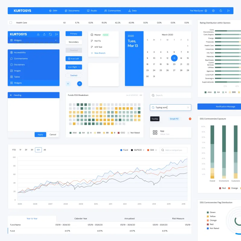
Component library. Shared interface components and their variants.
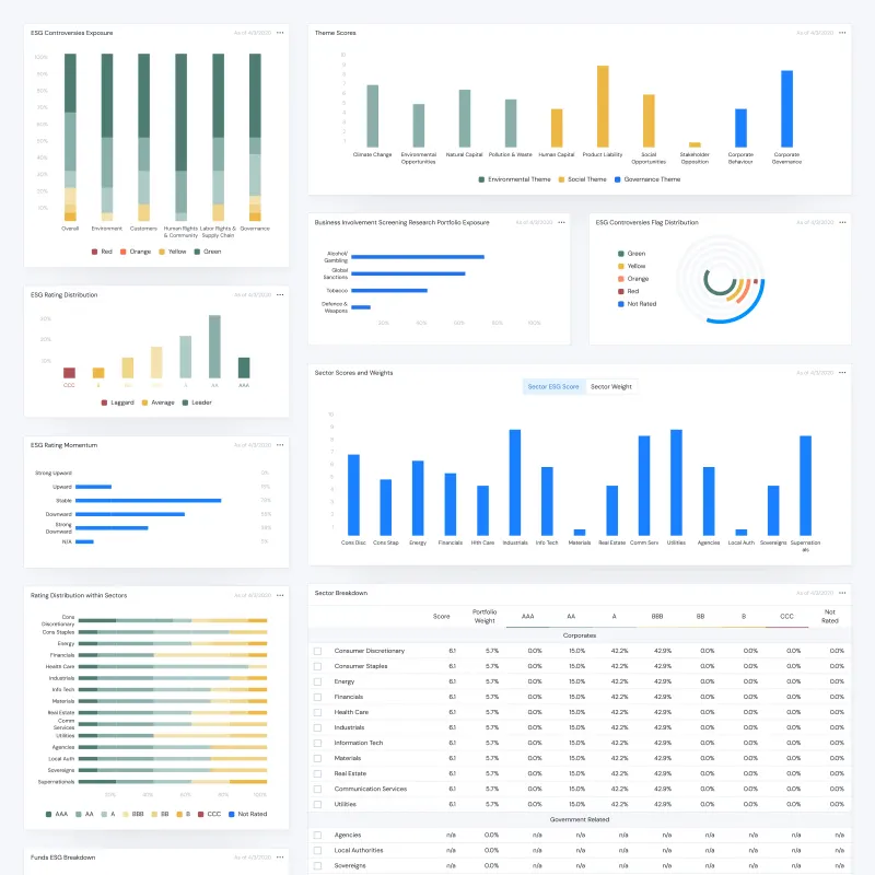
Data visualisation system. Financial and ESG reporting.
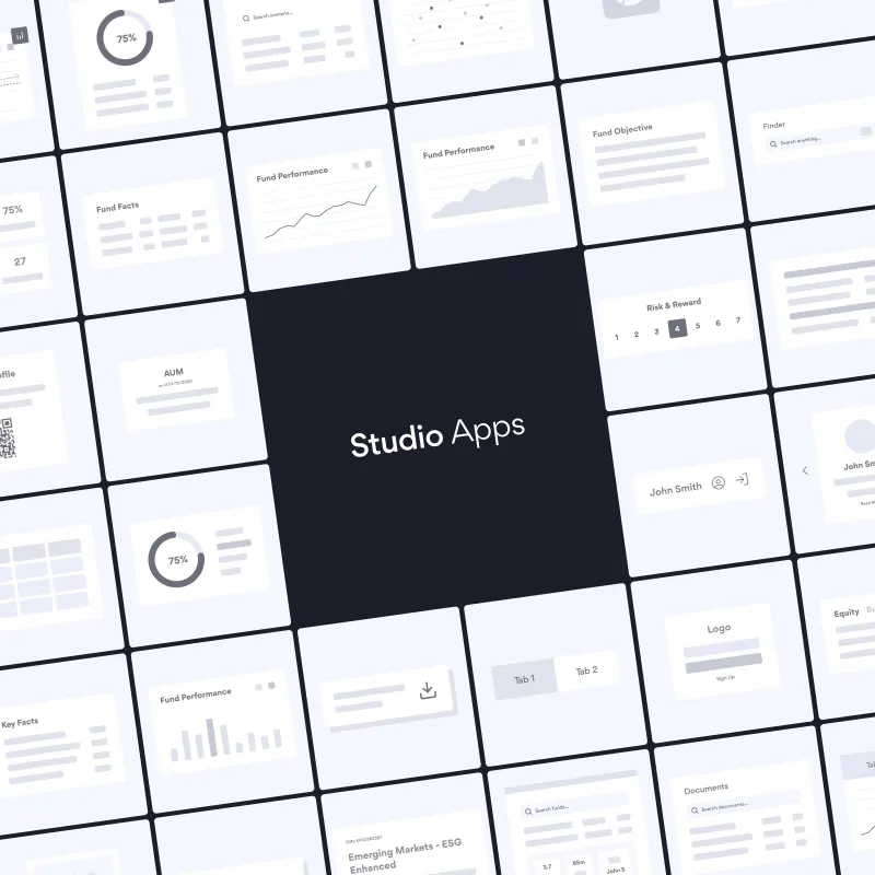
Studio Apps. Modular composition of client experiences.
Kapital was a fictional asset-manager brand and implementation reference, combining fund discovery, portfolio tools, documents, and analytics.
I adapted the reference for clients including BNY Mellon, SALI, BNP Paribas, and OP. Branding, layouts, and module selection varied; some briefs required substantial bespoke work.
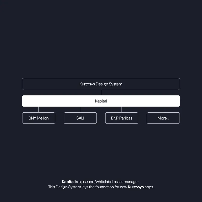
Reference architecture. The shared design system, Kapital reference, and client implementations.
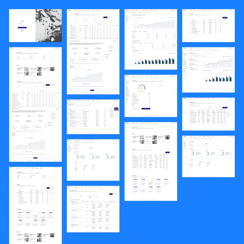
Kapital templates. A demonstration brand showing fund discovery, portfolio tools, and documents.
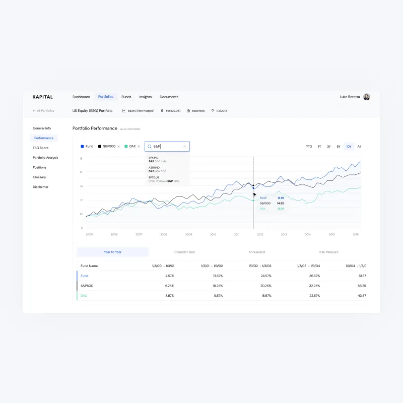
Portfolio performance. Benchmark comparison and analytics across fund positions.
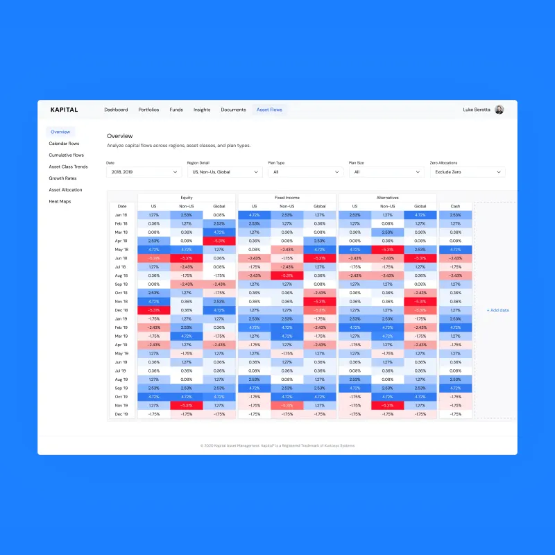
Asset flows. Capital flow analysis across regions, asset classes, and plan types.
Most client products involved dense financial information. I preserved that detail while improving typography, spacing, navigation, and consistency across charts, tables, and reports.
BNY Mellon was an early implementation where I developed many of the components later white-labelled for other clients.
Client presentations and feedback through product, engineering, and client services informed revisions.
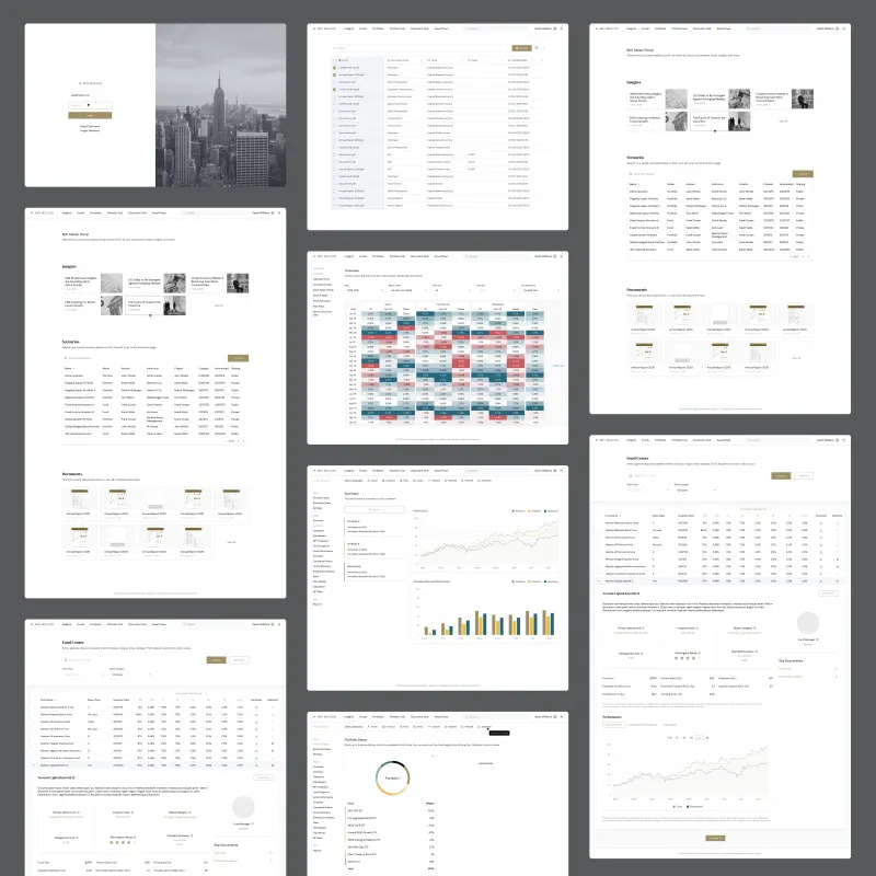
BNY Mellon portal. Investor portal covering authentication, fund discovery, and portfolio tools.
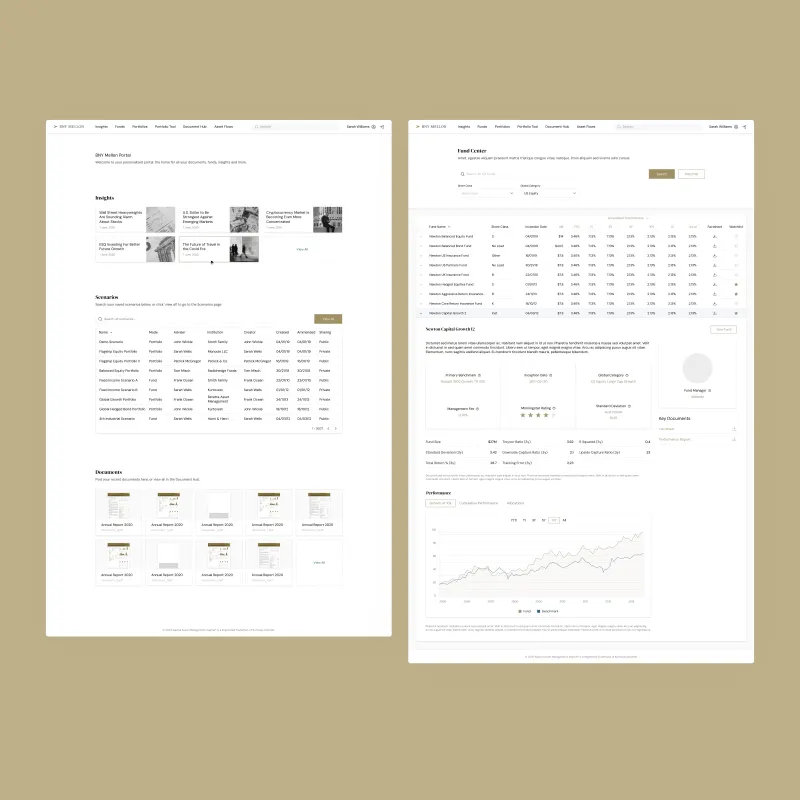
BNY Mellon dashboard. Performance analytics and portfolio overview.
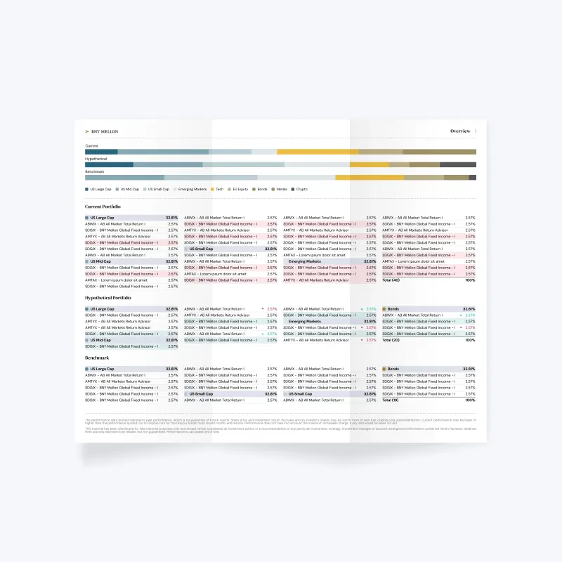
Print report overview. High‑density fund data across asset classes and benchmarks.
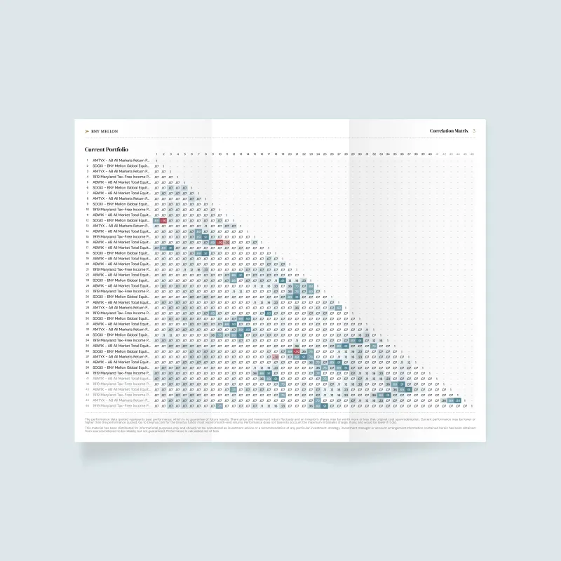
Correlation matrix. Keeping cross-fund comparisons readable in a dense report.
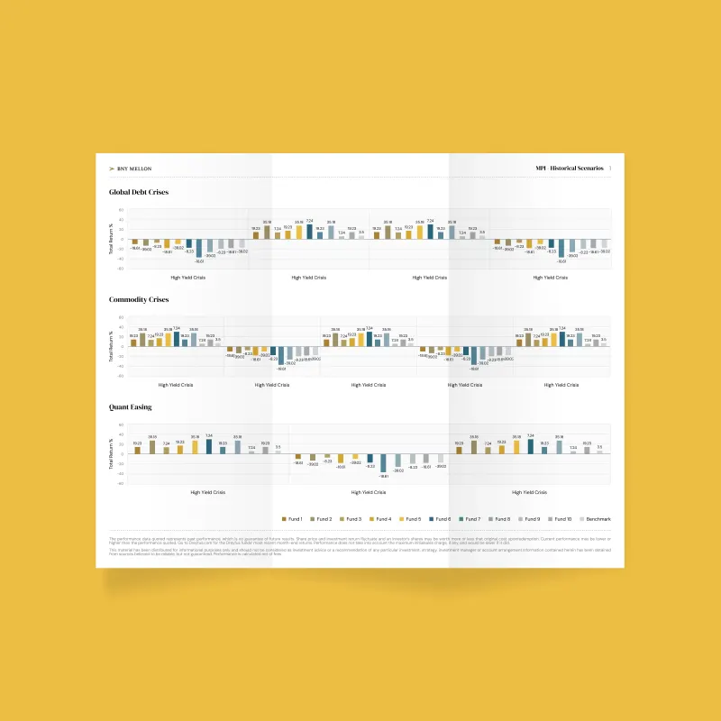
MPI report. Scenario analysis across fund sets with structured data hierarchy.
My remit expanded into brand with an external lead, marketing website design and implementation, and knowledge-base and API-documentation design.
I carried the same standards across those surfaces, reviewed marketing design, and continued working with product teams on implementation.
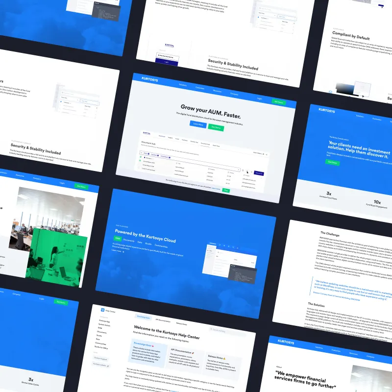
Website. Marketing pages and product narratives.
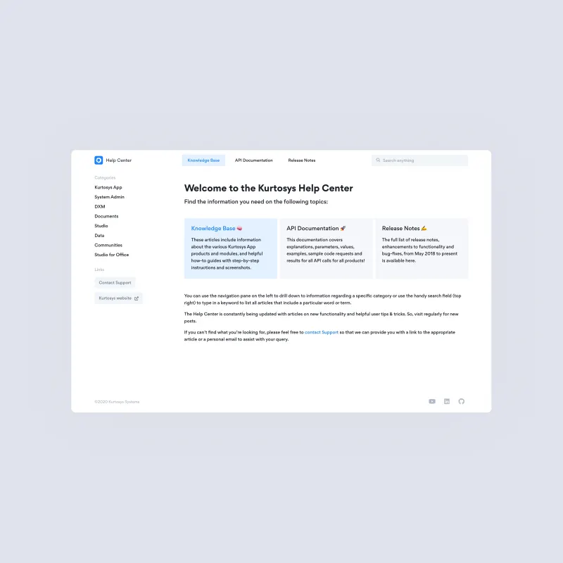
Documentation. Knowledge base and API reference.

Platform. Design system applied across the live product.

System view. All components and visual language in a single context.
Client projects adopted the templates, modules, and components as a shared foundation. Former colleagues and later work confirmed the system remained in use well after I left.
I maintained the foundation alongside delivery. Teams gained a shared starting point, and design entered product decisions earlier.
Peach Payments helps businesses accept and manage online payments. I owned design for the merchant dashboard, onboarding, and Peach Core, while setting direction and reviewing other designers’ work.
The remit covered getting merchants ready to accept payments and managing payments afterward. I also contributed mobile layouts and shared patterns to checkout, which another designer owned.
Role: Senior Product Designer
Timeline: Mar 2021 – Sep 2022
Team: Design, Engineering, Product, Marketing
Merchants needed to find transactions, understand status, and act. Support feedback, product and engineering input, and my review of the dashboard informed the redesign.
I kept details and refund actions in a side panel, preserving list context. Clearer statuses explained past events and next steps.
Filter-aware summaries supported monitoring. Mobile focused on that task; complex operations stayed on desktop. Payment links, permissions, and multiple business accounts supported daily operations.
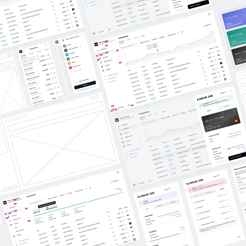
Dashboard. Merchant monitoring, transaction search, and payment actions.
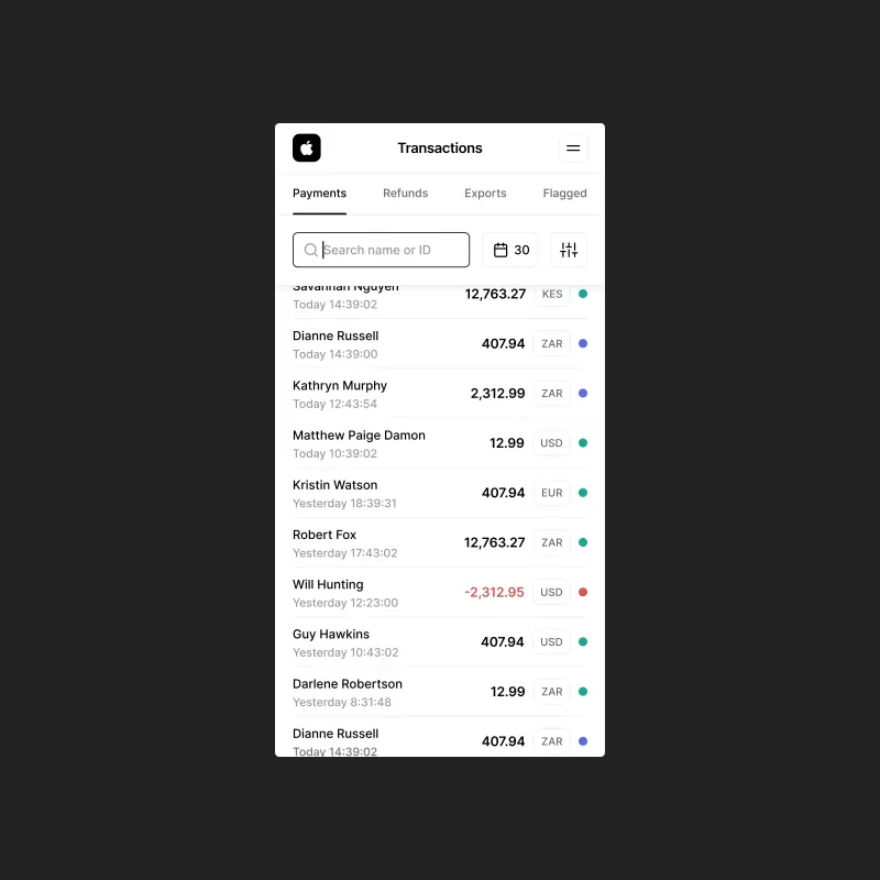
Mobile. iStore Cape Town instance, transaction list with currency flags, intentionally scoped for monitoring.
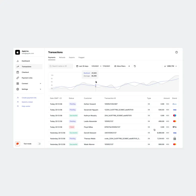
Transactions. Filter‑aware summary row, status pills, and payment brand logos.
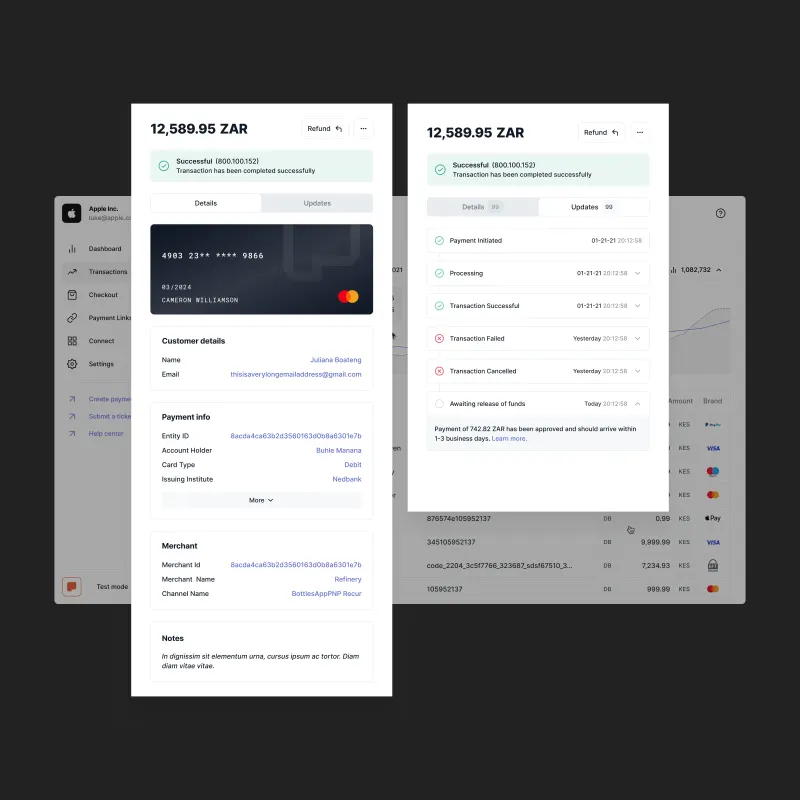
Transaction details. Payment information, status explanations, and an event timeline without leaving the list.
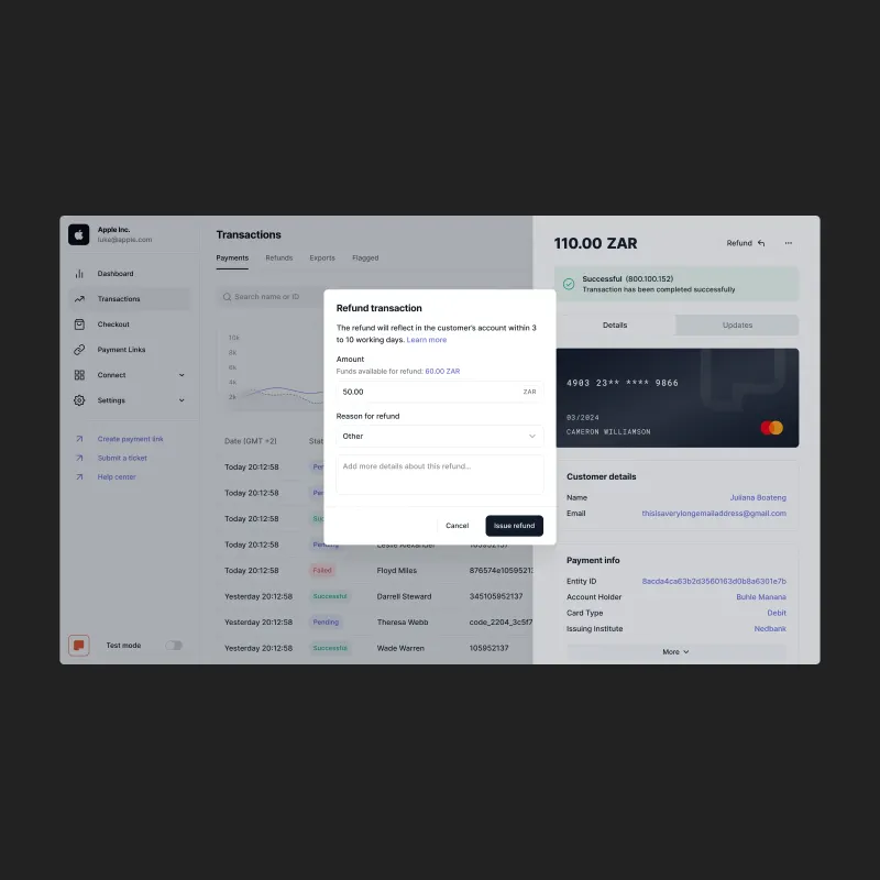
Refund. Amount, available balance, reason, and notes before confirmation.
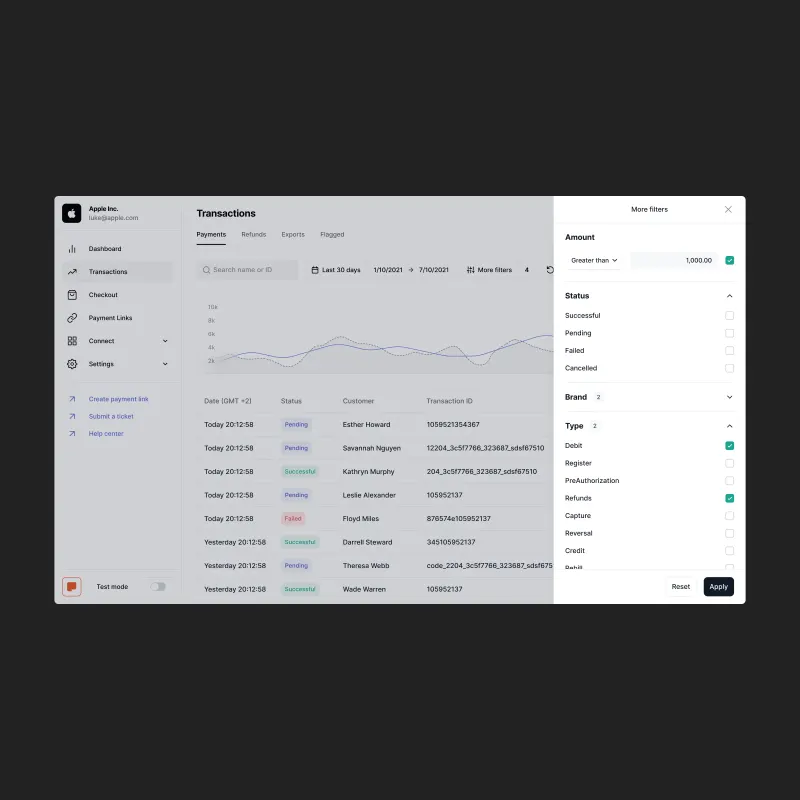
Advanced filters. Amount comparator, status, brand, and transaction type without cluttering the default view.
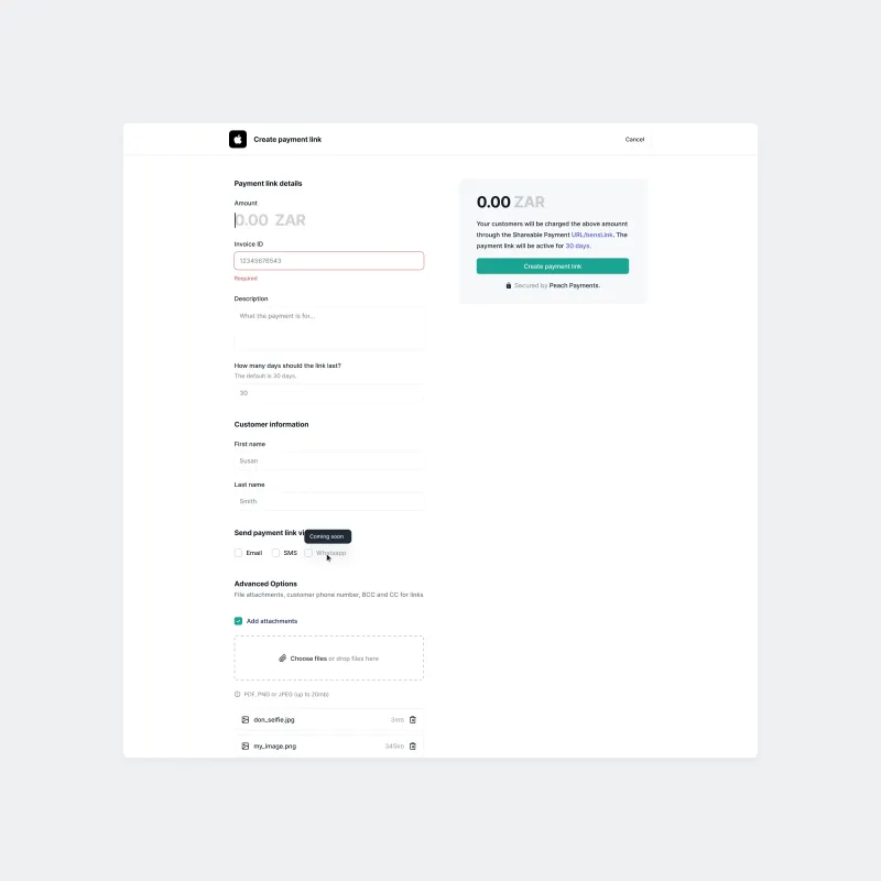
Payment links. List view with sending channel badges, link detail across three tabs, and a create flow with live preview and file attachments.
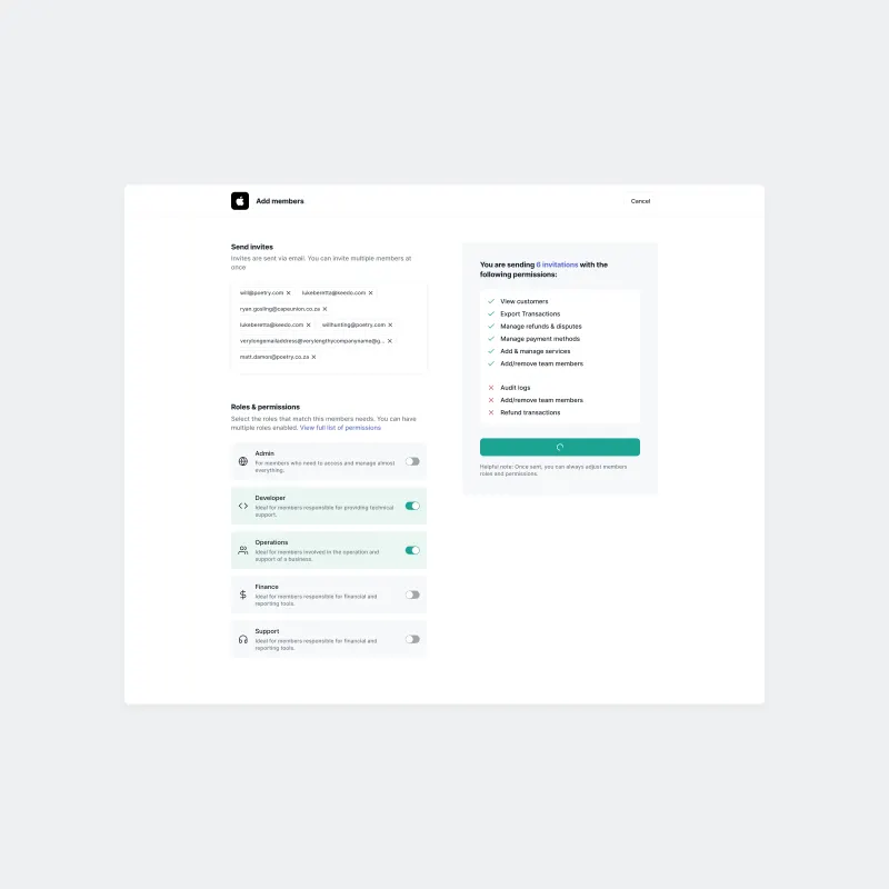
Team settings. Role‑based permission builder, live permission preview, member detail panel, and destructive action confirmation modals.
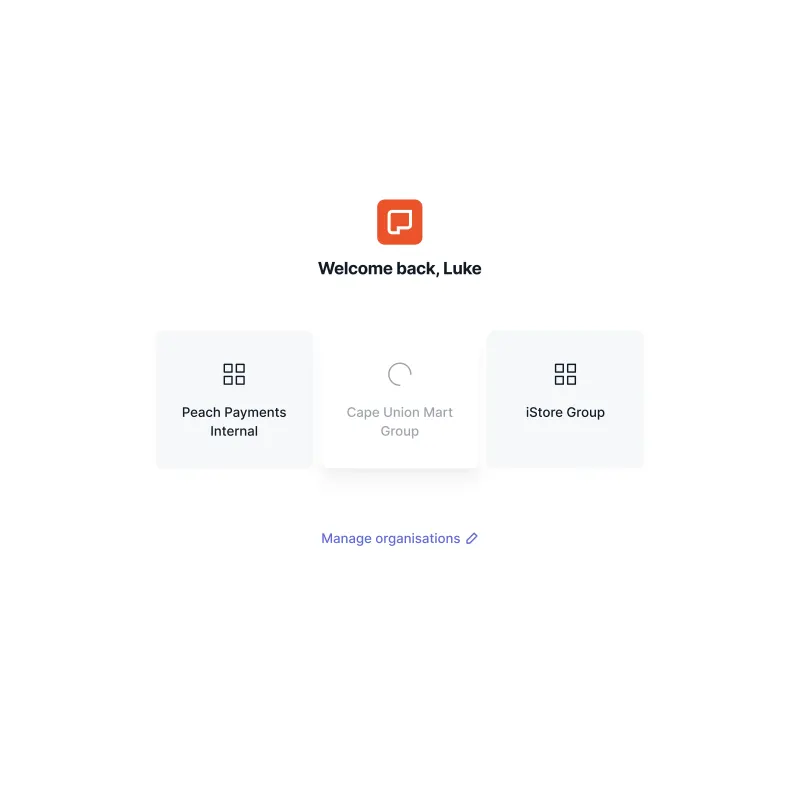
Organisation picker. Multi‑entity architecture, industry icons, real merchants including iStore Group and Cape Union Mart Group.
Approximately 90% of merchants who completed onboarding did so without assistance, according to leadership. Previously, every new merchant needed help.
I designed a common path that branched by business type and requested payment products. Product and engineering selected automated checks; I integrated verification, prefilled information, and document submission into the journey.
I designed mobile first, breaking forms into focused steps. Merchants could complete the journey on a phone, including document submission. Requirements, errors, and pending states explained the next action, with help for exceptions.
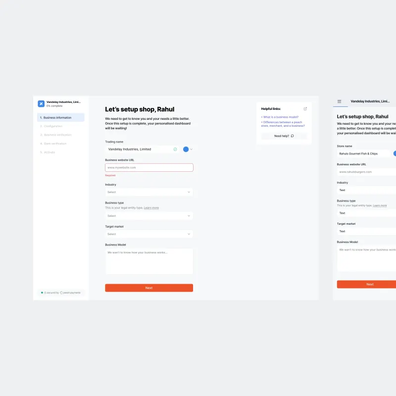
Step 1. Business information, with the generated industry icon appearing from the first field entry and the contextual help panel alongside.
Mobile. Sidebar nav, thumb‑friendly form layout, consistent merchant identity across breakpoints.
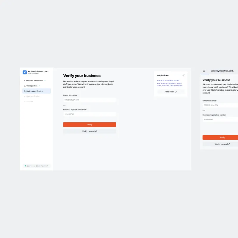
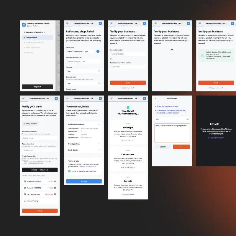
Business verification. Verification requirements and a manual alternative.
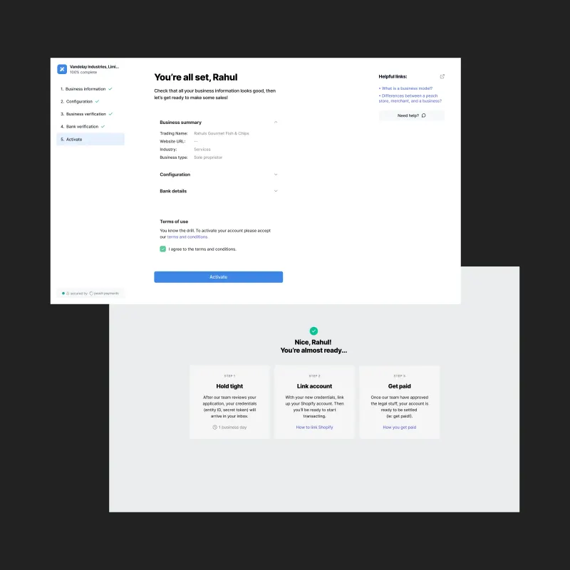
Activate. A business summary to review before submitting.
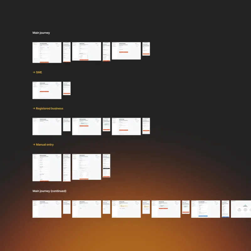
Verification paths. Business-type branches, manual entry, and desktop and mobile states.
Another designer owned checkout. I designed mobile layouts and interactions, contributed shared components, and reviewed the wider experience.
My work covered payment method selection, card entry, and billing address confirmation, aligned with Peach Core.
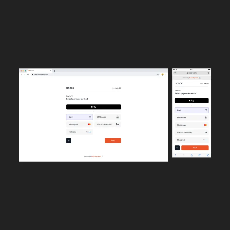
Step 1. Payment method selection, Apple Pay as primary CTA, alternative methods in branded grid.
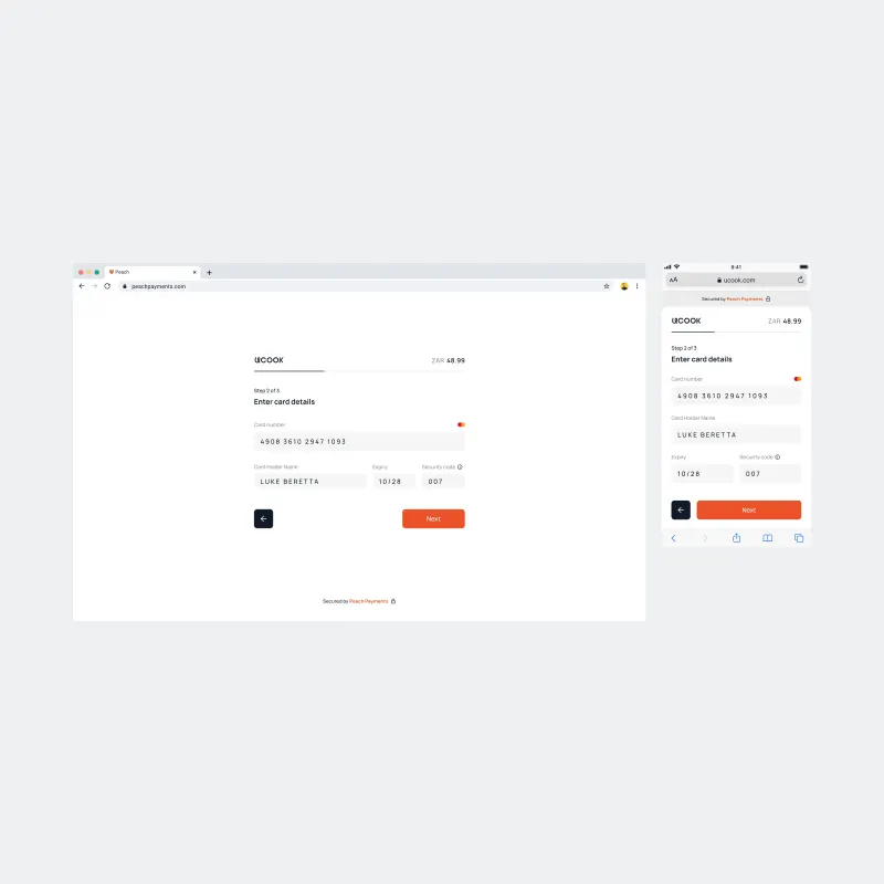
Step 2. Card detail entry with real‑time card brand detection, clean three‑column secondary row.
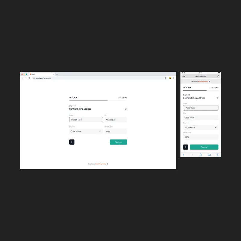
Step 3. Billing address confirmation, CTA shifts to green for the final payment commit.
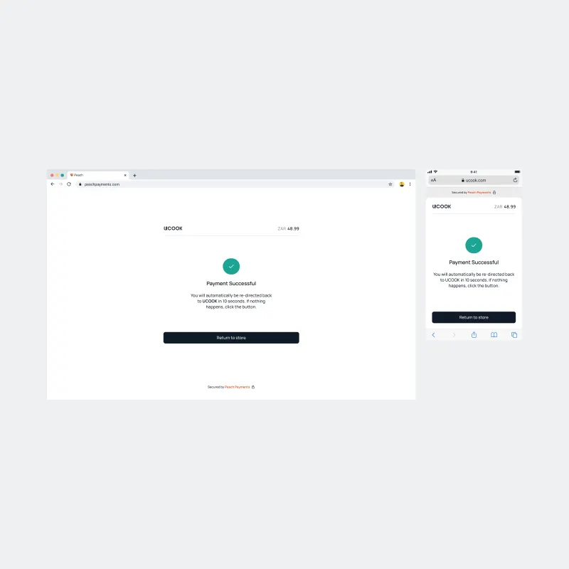
Success. Green checkmark, clear redirect messaging, calm and uncluttered.
I helped select the brand agency and shape direction with marketing. For product, I pushed for restrained styling that prioritised financial information.
Brand colour became an accent; statuses, amounts, and actions took priority. Peach Core carried those decisions into shared components for the dashboard, onboarding, and checkout.
Designers adopted the library; engineers built reusable components and used it as a reference. I specified behaviour, reviewed builds, and refined dashboard details in production frontend code.
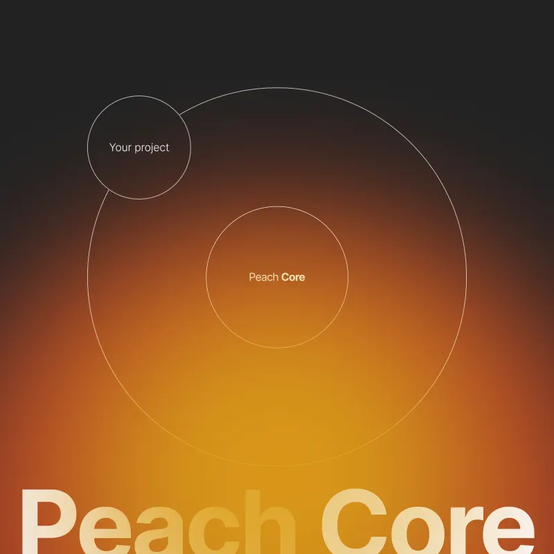
Peach Core. The core design system for all Peach Payments products, designed in Figma.
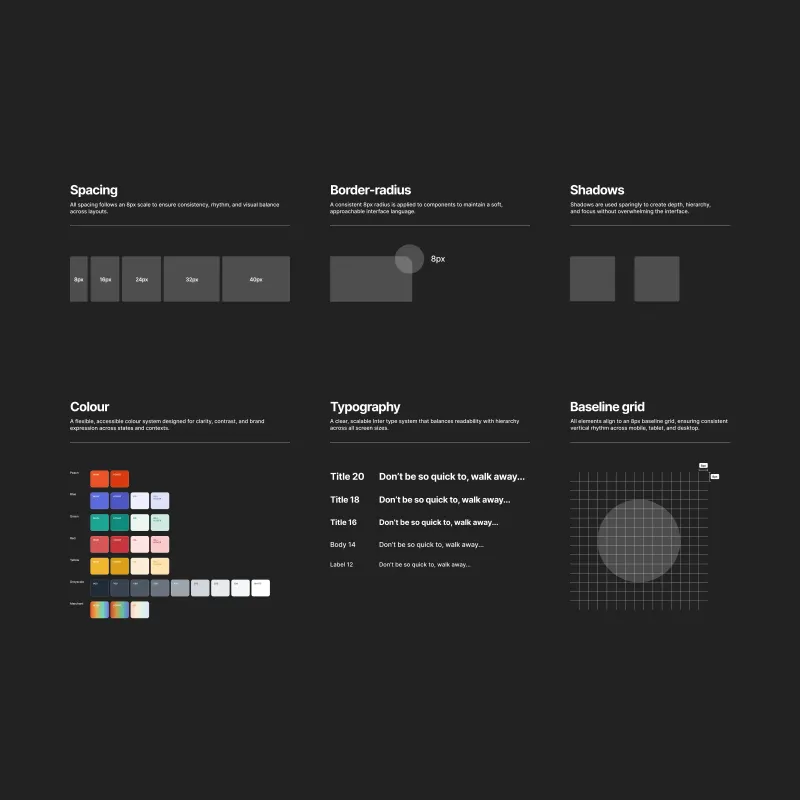
Foundations. Spacing multiples, 8px border radius, semantic colour palette, typography scale, baseline grid.
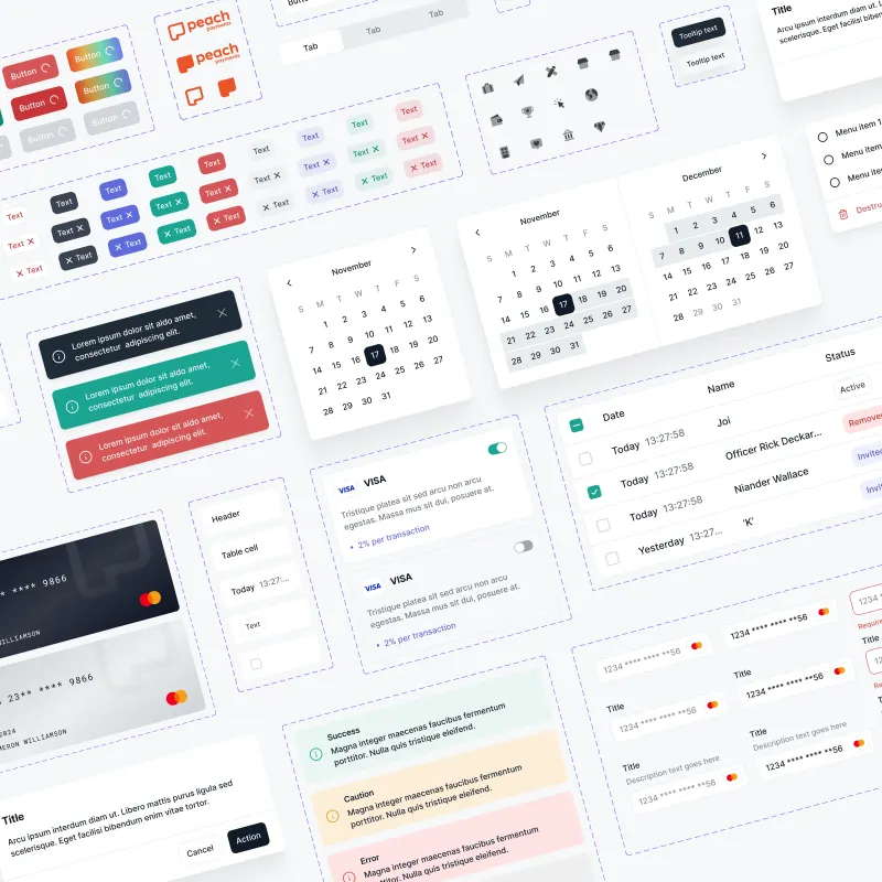
Component library. Shared interface components and their variants.
Leadership and operations reported handling more merchants without additional staff. Routine onboarding assistance decreased, freeing the team to focus on exceptions.
Peach Core gave designers and engineers a shared foundation. Dashboard and onboarding rollout continued at departure, with some parts still in development.
Night Shift is the studio I founded to plug small businesses into AI. We find where a team’s hours go, then build agents that take that work on and keep them running as the business grows.
We run the studio itself on agents I built. They research, write, build and check, and a person signs off every step. What we put into a client’s business, we have tested on our own first.
Role: Founder, AI engineer
Timeline: 2026 – Present
Every engagement starts with an audit of how the business actually runs. We rank where AI pays back first, connect agents to the tools the team already uses, then stay on to measure and improve them. A new site, store or brand only comes in when the work needs it.
Davnic was a small crypto fund that traded with its own bots. They grew a small starting balance into millions.
It was my first software engineering role. Until then I had taught myself to program through online courses. Here I wrote code that ran against live markets.
Role: Junior software engineer
Timeline: 2018, six months
I wrote the TypeScript API layers that connected the trading bots to each exchange.
I also built a separate bot that scanned the exchanges for arbitrage and sent an email whenever a price gap opened. It gave the fund a second source of revenue at very low risk.
Shipping production code for six months taught me software engineering and object-oriented design. It set the foundation for everything I have built since.
Finn is a trading bot I designed and built from scratch. It trades US stocks with real money, following one set of rules end to end. No AI makes trade decisions.
It buys stocks breaking out after a strong run and sizes each position against a fixed risk budget. Every order passes a risk manager that can veto it, and every position carries a stop.
Role: Solo, strategy to code
Timeline: 2026 – Present
Stack: Python, Alpaca
Live account returns since inception, against the S&P 500. Deposits are excluded. The chart updates after each US market close.
Calculated from daily closes over the same period as the chart. Volatility is annualised, and drawdown is the largest fall from a previous high.
Case studies are password protected. Email me to request access.